

Introduction: Why Business Intelligence Tools Matter
If you have worked with Excel sheets filled with rows of data, you already know one thing: raw data alone is not enough. Businesses today don’t just need data, they need insights they can act on quickly.
This is where Business Intelligence tools come in.
Modern organizations rely on dashboards to monitor performance in real time. Instead of manually analyzing spreadsheets, decision makers use interactive dashboards that instantly show trends, performance metrics, and key insights.
In simple terms, Business Intelligence tools are software that transform raw data into visual dashboards.
For example, instead of checking thousands of sales records, a company can view a dashboard that instantly shows total revenue, top performing products, and regional performance.
At Neody IT, we emphasize that learning BI tools is a major step in becoming a job ready data analyst. These tools bridge the gap between data and decision making.
What Are Business Intelligence (BI) Tools?
Simple Definition
Business Intelligence tools are software applications used to analyze data and present it through visual dashboards, charts, and reports.
Why They Are Important
BI tools play a critical role in modern data analytics because they:
-
Help in faster decision making
-
Automate reporting processes
-
Make data interactive and easy to explore
Instead of static reports, BI tools allow users to interact with data, apply filters, and explore insights dynamically.
Two of the most popular BI tools used in the industry are Power BI and Tableau. These tools are widely adopted by companies for business reporting and analytics.
Introduction to Power BI
What is Power BI
Power BI is a Business Intelligence tool developed by Microsoft that helps users create dashboards and reports from various data sources.
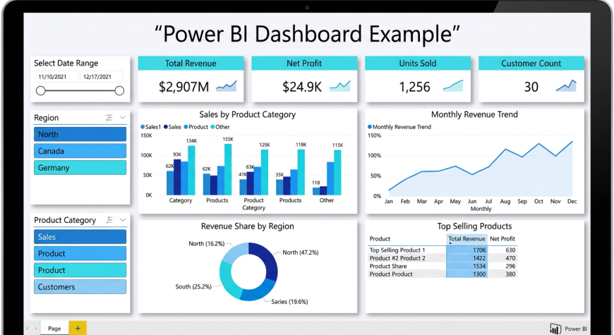
Key Features
Power BI offers several powerful features:
-
Ability to connect with multiple data sources such as Excel, SQL databases, and cloud platforms
-
Interactive dashboards with real time updates
-
Easy to use interface for beginners
Why Beginners Should Learn Power BI
Power BI is an excellent starting point for beginners because:
-
It is easy to learn and user friendly
-
It is widely used in the industry
-
It integrates seamlessly with Excel and other Microsoft tools
For someone starting their journey with Neody IT, Power BI provides a practical way to build real world analytics projects.
Introduction to Tableau
What is Tableau
Tableau is a powerful data visualization tool known for creating highly interactive and visually appealing dashboards.
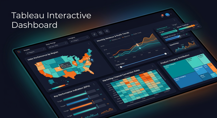
Key Features
Tableau stands out because of:
-
Drag and drop interface
-
Advanced visualization capabilities
-
Strong focus on data storytelling
Why Tableau is Popular
Tableau is widely used by professionals because it allows users to create complex visualizations easily and present insights in a compelling way.
It is especially popular in organizations that focus heavily on visual storytelling and advanced analytics.
Power BI vs Tableau
Understanding the difference between these tools helps beginners choose the right one.
Tool | Best For | Ease of Use | Use Case
Power BI | Beginners, Microsoft users | Easy | Business reporting
Tableau | Advanced visualization | Moderate | Data storytelling
Both tools are powerful. The choice depends on your goals. Beginners often start with Power BI, while Tableau is preferred for advanced visualizations.
Connecting Data Sources
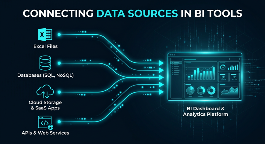
What Does Connecting Data Mean
Connecting data means importing data from different sources into a BI tool for analysis.
Common Data Sources
In real world scenarios, data comes from multiple systems such as:
-
Excel files
-
SQL databases
-
APIs
-
Cloud platforms
Why It Matters
Businesses rarely store all data in one place. BI tools help combine data from multiple sources, making analysis more complete and accurate.
This ability to connect and unify data is one of the biggest strengths of BI tools.
Building Dashboards
What is a Dashboard
A dashboard is a collection of visual elements such as charts and graphs that display key insights in one place.
Key Elements of a Dashboard
A well designed dashboard typically includes:
-
Charts and graphs
-
Filters and slicers
-
Key Performance Indicators (KPIs)
Example Dashboard
A sales dashboard might include:
-
A revenue trend chart
-
Top performing products
-
Region wise sales performance
Dashboards help businesses monitor performance quickly and make informed decisions without digging into raw data.
Interactive Visualizations
What Makes Visualization Interactive
Unlike static charts, interactive visualizations allow users to explore data by clicking, filtering, and drilling down into details.
Examples
-
Clicking on a region shows detailed sales data
-
Applying a date filter updates all charts
Why It Matters
Interactive dashboards make data analysis dynamic. Instead of relying on analysts for every query, users can explore data themselves.
This improves efficiency and decision making speed in organizations.
Real World Use Cases
Business Analytics
Companies use BI tools to build dashboards for:
-
Sales performance tracking
-
Revenue analysis
Marketing Analytics
Marketing teams analyze:
-
Campaign performance
-
Customer engagement
Financial Reporting
Finance teams use dashboards for:
-
Profit analysis
-
Expense tracking
BI tools are used across industries because they simplify complex data into actionable insights.
Beginner Power BI Tutorial
For beginners, getting started with Power BI can be simple.
Basic steps include:
-
Import your dataset
-
Clean and prepare the data
-
Create charts and visuals
-
Build a dashboard
-
Add filters for interactivity
Starting with a simple dataset like sales data is a great way to practice.
Tableau Overview for Beginners
The workflow in Tableau is similar but more focused on visualization.
Steps include:
-
Connect to a data source
-
Drag and drop fields to create charts
-
Build interactive dashboards
Tableau allows users to create visually rich dashboards that focus on storytelling.
Common Mistakes Beginners Make
While learning BI tools, beginners often make mistakes such as:
-
Adding too many charts in one dashboard
-
Not using filters effectively
-
Poor layout design
-
Ignoring user experience
How to Fix Them
-
Keep dashboards simple
-
Focus on key insights
-
Design with the end user in mind
At Neody IT, we always recommend starting simple and gradually improving dashboard design.
Best Practices for Dashboard Design
To create effective dashboards, follow these principles:
-
Keep layout clean and organized
-
Use consistent colors
-
Highlight key metrics
-
Make navigation simple
A good dashboard is not about showing everything. It is about showing what matters most.
Practice Ideas for Beginners
To build real skills, try these exercises:
-
Create a sales dashboard using Power BI
-
Build a monthly revenue trend chart
-
Design a simple Tableau dashboard
Hands on practice helps you understand how data transforms into insights.
Why BI Tools Are Important for Data Analysts
BI tools are essential in modern data roles because they:
-
Help present insights clearly
-
Are used in almost every data job
-
Improve decision making
A data analyst is not just someone who analyzes data. They are someone who communicates insights effectively. BI tools make this possible.
Final Takeaway
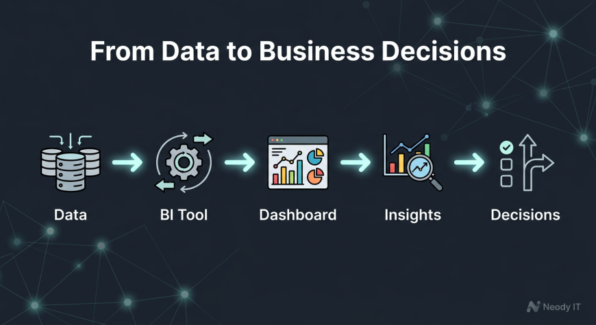
Power BI and Tableau transform raw data into interactive dashboards that drive business decisions.
Instead of working with static spreadsheets, analysts use BI tools to create dynamic and insightful reports.
The workflow is simple:
Data → BI Tool → Dashboard → Insights → Decisions
For learners at Neody IT, mastering BI tools is a major step toward becoming a professional data analyst. These tools are not just technical skills. They are the foundation of real world data analysis.
Start with simple dashboards, practice regularly, and focus on clarity. That is how you build strong analytics skills.

Please don't enter any spam link in comment box