

Types of Charts for Data Analysis: Beginner Guide
Introduction: Why Choosing the Right Chart Matters
When beginners start learning data analysis, they often focus on tools and techniques but overlook one critical skill: choosing the right chart. Data visualization is powerful, but using the wrong chart can confuse your audience and lead to incorrect conclusions.
Think about it this way. You may have the right data and correct analysis, but if you present it poorly, the insight loses its impact. A well chosen chart makes your findings clear, simple, and easy to understand.
Not all charts are designed for the same purpose. A line chart is great for showing trends over time, while a bar chart is better for comparing categories. If you mix them up, your message becomes unclear.
At Neody IT, we emphasize that visualization is not just about creating charts. It is about communicating insights effectively. Choosing the right chart is the first step toward becoming a skilled data analyst.
What Are Data Visualization Charts
Simple Definition
Charts are visual representations of data that help communicate insights quickly and effectively. Instead of reading raw numbers, users can understand patterns through visuals like bars, lines, and segments.
Why Charts Are Important
Charts play a key role in data analysis because they:
-
Simplify complex datasets
-
Highlight patterns and trends
-
Improve decision making
-
Make data understandable for non technical users
In real life, charts are used everywhere. Businesses use them to track sales performance, marketers analyze website traffic using graphs, and dashboards combine multiple charts to give a complete overview.
Overview of Common Chart Types
For beginners, it is important to master a few core chart types before moving to advanced visualizations. The most commonly used charts include:
-
Bar Chart
-
Line Chart
-
Pie Chart
-
Histogram
These charts cover most real world use cases in data analytics and form the foundation of visualization skills.
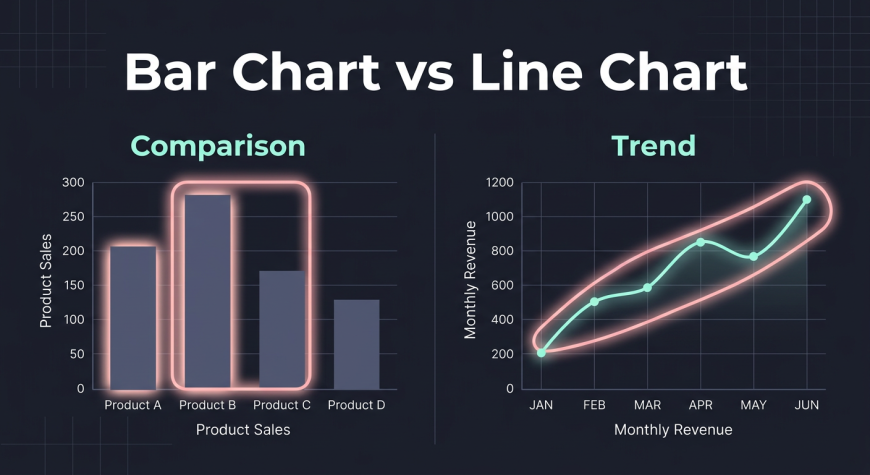
Bar Chart: Comparing Categories
What is a Bar Chart
A bar chart uses rectangular bars to compare values across different categories. Each bar represents a category, and its height shows the value.
When to Use
Bar charts are ideal when you want to compare:
-
Products
-
Regions
-
Categories
-
Departments
Example
A company can use a bar chart to compare sales of different products or revenue generated across regions.
Why It Works
Bar charts are easy to read and understand. They clearly show differences between values, making comparisons straightforward.
Line Chart: Showing Trends Over Time
What is a Line Chart
A line chart connects data points with a line to show changes over time.
When to Use
Use line charts when analyzing:
-
Growth trends
-
Time based data
-
Continuous data changes
Example
A business can track monthly revenue or website traffic using a line chart to see growth or decline over time.
Why It Works
Line charts make it easy to spot increases, decreases, and patterns across time periods.
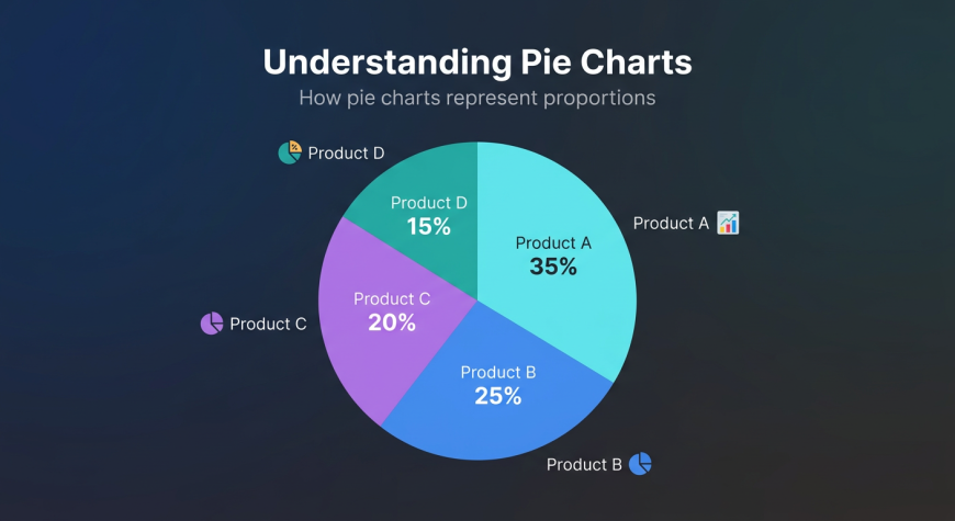
Pie Chart: Showing Proportions
What is a Pie Chart
A pie chart divides data into slices, where each slice represents a portion of the whole.
When to Use
Pie charts are best used for:
-
Percentage distribution
-
Market share
-
Contribution analysis
Example
A company may use a pie chart to show how much each product contributes to total revenue.
Limitations
Pie charts become difficult to read when there are too many categories. In such cases, bar charts are a better choice.
Histogram: Understanding Data Distribution
What is a Histogram
A histogram shows how data is distributed across ranges. It groups numerical values into bins and displays their frequency.
When to Use
Histograms are useful for:
-
Understanding data spread
-
Identifying patterns
-
Analyzing frequency
Example
A histogram can show the distribution of customer ages or exam scores.
Why It Works
It helps identify patterns such as whether data is evenly distributed, skewed, or clustered.
Chart Comparison Guide
Understanding when to use each chart is essential.
Chart Type | Best Use | Example
Bar Chart | Compare categories | Sales by product
Line Chart | Show trends | Monthly revenue
Pie Chart | Show proportions | Market share
Histogram | Show distribution | Age distribution
The key idea is simple. The chart you choose depends on the question you want to answer.
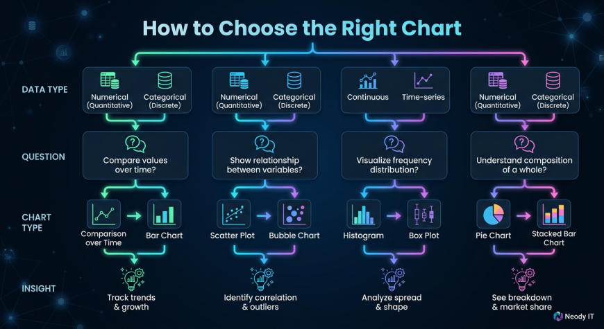
How to Choose the Right Chart
Ask the Right Question
Before creating a chart, ask yourself what you want to show.
-
Comparing categories → Bar chart
-
Showing trends → Line chart
-
Showing proportions → Pie chart
-
Understanding distribution → Histogram
Keep It Simple
Avoid unnecessary complexity. A simple chart is more effective than a complicated one.
Focus on Clarity
Always choose a chart that makes your data easy to understand for the audience.
Real World Examples
Business Analytics
Companies use bar charts to compare sales across regions and line charts to track revenue growth over time.
Marketing Analytics
Marketing teams analyze website traffic trends using line charts and use pie charts to understand traffic sources.
Customer Analysis
Businesses use histograms to understand customer demographics such as age distribution.
In real scenarios, analysts often combine multiple charts to create a complete analysis.
Common Mistakes Beginners Make
Many beginners struggle with chart selection. Some common mistakes include:
-
Using pie charts for too many categories
-
Using line charts for non time based data
-
Overloading charts with too much information
-
Ignoring labels and titles
How to Fix Them
-
Match chart type with data type
-
Keep visuals clean and simple
-
Always include proper labels
-
Focus on readability
Visualization Best Practices
To create effective charts, follow these best practices:
-
Use clear titles and axis labels
-
Choose appropriate colors
-
Avoid clutter and unnecessary elements
-
Highlight key insights
A good chart is not just visually appealing. It communicates a clear message.
Practice Ideas for Beginners
The best way to learn is through practice.
Try these tasks:
-
Create a bar chart for product sales
-
Build a line chart for monthly revenue
-
Create a pie chart for category distribution
-
Make a histogram for age or score data
At Neody IT, we encourage beginners to practice with real datasets. This helps build confidence and understanding.
Why Chart Selection is Important for Data Analysts
Chart selection is not just a design choice. It directly affects how your data is interpreted.
A well chosen chart:
-
Communicates insights clearly
-
Prevents confusion and misinterpretation
-
Improves storytelling
A poor chart can hide important insights or even mislead decision makers.
A skilled data analyst knows not only how to analyze data but also how to present it effectively.
Final Takeaway
Choosing the right chart is a fundamental skill in data visualization.
Each chart type has a specific purpose. When used correctly, charts transform raw data into clear and actionable insights.
The workflow is simple:
Data → Choose Chart → Visualization → Insights → Decisions
At Neody IT, we believe that mastering chart selection is a key step toward becoming a confident data analyst. Once you understand which chart to use and when to use it, your ability to communicate data will improve significantly.
Start simple, practice regularly, and focus on clarity. That is how great data analysts are built.

Please don't enter any spam link in comment box